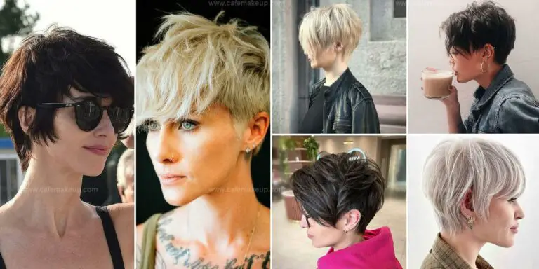
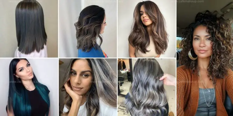
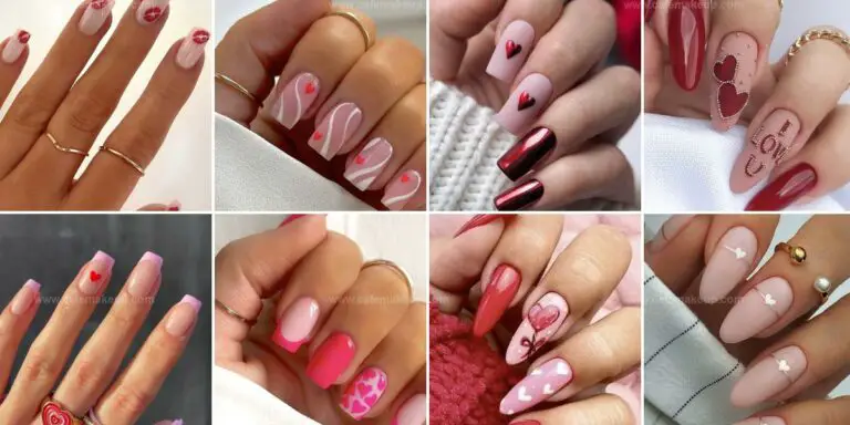
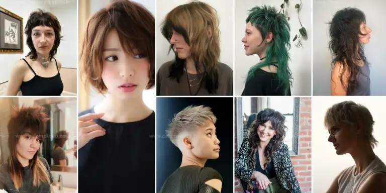
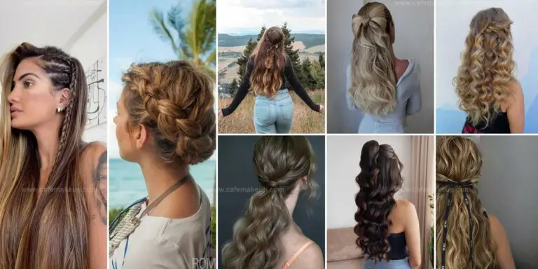
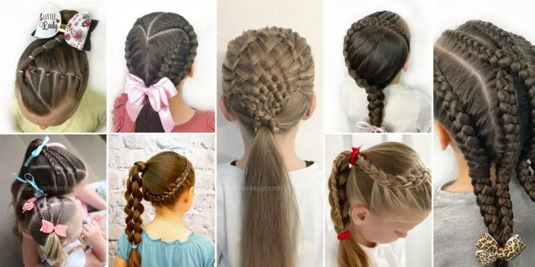
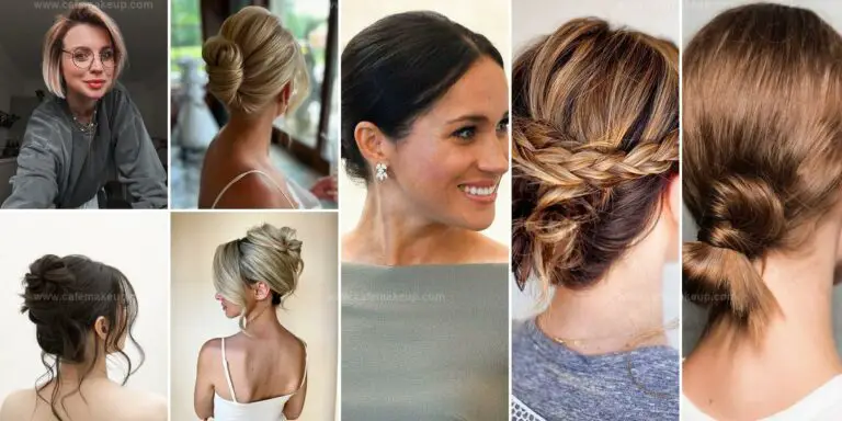
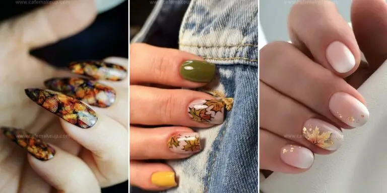
Jan 162010
 

Giorgio Armani’s Spring 2010 “Nude Contrasts” collection includes a beautiful neutral palette that I purchased from their online site “Nude Contrasts Palette 2.” ($58).  The packaging is a shiny black version of Armani’s iconic disc.  Both beautiful and functional, these palettes withstand endless and ruthless travel conditions.  Not all of my compacts have survived the airline’s checked luggage handling, but all my Armani’s work as well as new.

Inside are four gorgeous spring colors, three are variations of nude.

Who knew that nude could be so…. complicated? There is no overspray–what you see is what you get.  Fortunately, what you get is a lovely shimmery range of neutrals that can span a range of skin-tones from cool to warm.  There’s a multi-dimensional shimmer throughout the pressed pigment that’s just so (sigh!) pretty.

This is a light-toned shimmery palette.  Adding a touch of black is a useful addition.  You need a dark, even for this palette.  So use this black, which coordinates perfectly and and isn’t going to overwhelm the other shades.

Is this palette a must-have?  Probably not, but the quality of the shadows is discernibly better than a $10/palette neutral version.  There is a very finely milled texture and subtlety that allows the shimmer to look elegant and refined, rather than harsh or too-obvious.

Swatches below (two angles, the swatches are in the same order in both, only one is labeled) so that you can see the texture and shimmer more specifically under different lighting.  Click to enlarge:

Jan 152010
 

As an overview, MAC Pro blushes are not as easy to work with as their standard line but they offer a very unusual combination of shades.  I imagine that a pro who needs to do numerous faces over the course of a morning can apply these highly-pigmented blushes without concern of ever running out and, because of their expertise and wide selection of different blush brushes, can control their highly pigmented nature.

For the average user, these offer some variety and the chance to work with something unusual.  I have not reviewed all of MAC’s pro blushes, but only those that work for me.  A full list of MAC’s current Pro blushes is here on their website.  I highly doubt that all will work with every skin tone, so if you get a chance to try them at a MAC Pro store I would recommend it.

You can obtain the address of MAC Pro stores by checking on their website.  If you cannot, but wish to order a Pro product, every MAC Pro store can ship you their products by obtaining your payment information over the phone. In addition, you can buy MAC Pro products by calling the company at 1 800 588 0070 (U.S. only).

If you’re into makeup, you’ll see references to ”MAC Pro Member” and “MAC Pro Discount” around.  Only MAC Pro members can order directly from the MAC Pro website.  I’m neither, but you can find out more information about their program here.

MAC Pro Blush: Taupe

 Blush, MAC  Comments Off
Jan 142010
 

MAC’s Pro blush in Taupe is a neutral-to-cool finely milled matte powder.  As you can see, it doesn’t resemble most blushes or bronzers at all.  I’ve read that it’s frequently recommended as a contour powder.  I’ve been working with it over the past few days and this is my advice:

1.  This will work best on fair/medium cool-toned skin tones.  If you find that most contour powders are too warm/golden for you, this is the one to look at next.  I’m fair and slightly warm.  Although I can usually handle a cool-toned pink, this leans a bit toward grey on me.

2.  This may not show up at all on darker skin tones, and could turn a bit ashy.

3. Although I’m fair and can handle some deep golden bronzers, I have to use a light hand with Taupe.  Because of the grey tones in the blush, it can start to look a bit too dirty on the skin if applied too heavily.  You can start to see this in the center of the swatch, below, which was applied with a compact eyeshadow brush.

Although I find this difficult to work with, I’m glad that I picked it up before it disappeared.  It’s unusual enough–I’ve honestly never seen another product quite like it.

Jan 132010
 

Chanel’s Kaska Beige Quad is beautiful mix of beige, gold and purple.

  • The lightest highlight shade is a warm cream, it’s very subtle on lighter skintones.
  • A warm, shimmery gold-taupe
  • A nearly matte, mid-tone mauve
  • A deep, shimmery jeweled amethyst

Based on my initial review, I recommend the palette.  It’s a neutral quad, but the mauve and amethyst keep this from being dull.  I love the mix of shimmer and matte.  I usually resist buying mattes, but when I put an entire eye together I realize that they are really needed to allow the shimmery colors to really sparkle.  After all, an all-shimmery eye can give a metallic cast to the eye area that detracts.  Enjoy the pictures and let me know what you think….

Jan 132010
 

China Glaze’s Up & Away candy-colored spring collection is now for sale on Transdesign (click on “polishes,” then “China Glaze” to get there).  At $2.60 per bottle, these are a steal.

I’ve found that the formula for my China Glaze polishes is excellent, and so far reviews of this collection are good.

Lately, I’ve been craving some lighter tones in my collection, this one has several versatile for both weekends and work days.